Animated Show More toggle in React

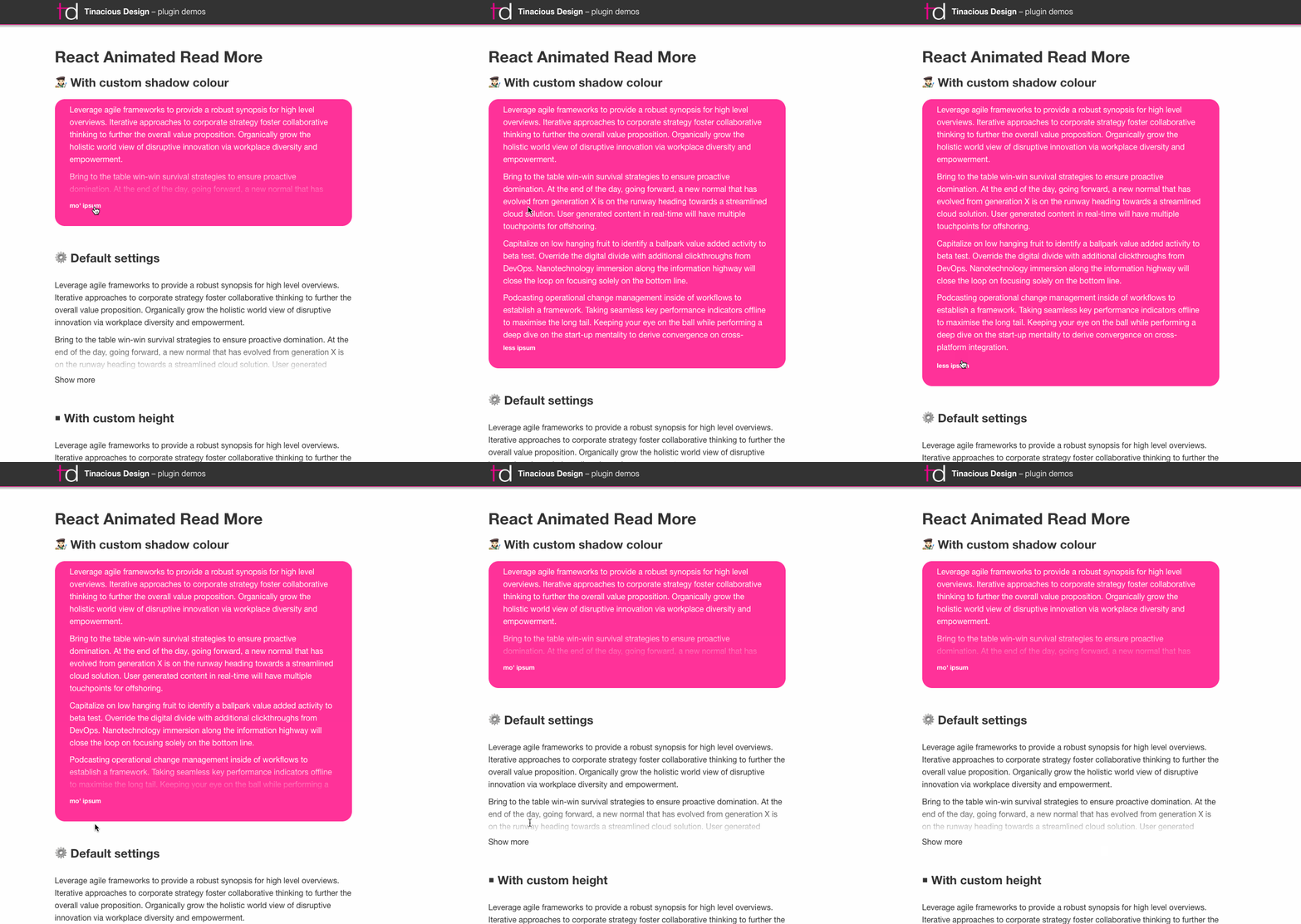
React Animated Show More is a simple, fully-customizable component that expands and collapses to show your content.
Why use React Animated Show More?
- It works!
- It uses the latest React version which introduces Hooks, and it's awesome!
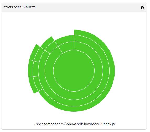
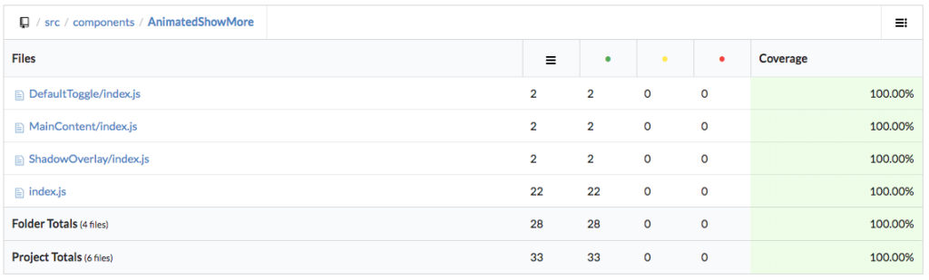
- It's well-tested and boasts 100% test coverage for both rendering and behaviour
- It uses CSS transitions for animating
- It's fully customizable
- It's open-source, so if you think it could use an improvement, you can contribute on Github!
Features
This Animated Show More toggle allows you to customize a number of items:
- Custom toggle component which supports render prop
isOpen heightto customize the collapsed heightspeedto customize the animation speedshadowColorto customize the small shadow overlay that helps your users see that there's more to read. This was designed to be used on any background colour.
I built this library to test out Hooks in React 16.8. That said, this project requires at least React 16.8 in order to use it.
Usage
Installation
To use this component in your React project that supports hooks, simply run one of the following scripts.
For NPM:
npm install --save react-animated-show-more
For Yarn:
yarn add react-animated-show-more
Implementation
To implement the React Animated Show More toggle, just wrap it around your lengthy content to trim it down.
You just pass in your configuration props for height, overlay shadow gradient colour, animation speed, and custom toggle component.
import React from 'react';
import AnimatedShowMore from 'react-animated-show-more';

// ...

<AnimatedShowMore
  height={100}
  toggle={({ isOpen }) => isOpen ? 'Close!' : 'Open!' }
  speed={2000}
  shadowColor="#000">

  {/* Lots of stuff goes here */}
  <DemoText />

</AnimatedShowMore>
That's all there is to it. It's a simple plugin with minimal styling that allows you to provide your own component that expands and/or collapsed when you click it.
More info
- Check out React Animated Show More on npmjs
- Check out the source code on Github – contributions welcome
- Check out a working demo
- See more code coverage info
If you like what you see and would like me to speak at your conference or help you part-time on a project, feel free to contact me.
About the author
Hi, my name is Tina! I am a Full Stack Software Developer and Tech Lead from Canada. 🙋🏻♀️
Comments
Join the discussionNo comments yet. Be the first to comment.