Use BEM for scalable and maintainable CSS

Hi, my name is Tina! I am a Full Stack Software Developer and Tech Lead from Canada. 🙋🏻♀️
BEM CSS stands for Block Element Modifier, which is a CSS methodology to help you write maintainable CSS.
Here's BEM's official website but keep reading for a brief overview.
BEM Basics
BEM takes a component-based approach to CSS development. It has some strict rules about inheritance and how to write your CSS selectors.
Rules for Inheritance
To follow BEM properly, you should not use inherited CSS styles in order to style your components.
Some CSS properties are inheritable like font- and table-related properties, but most are not (more info).
In order to follow this rule, you should set inherited properties explicitly, where applicable. So, for example, if you are building a card component but the whole card has a smaller font size, all text elements should have their font sizes specified explicitly rather than inheriting the smaller font size from the parent.
This rule exists in order to prevent bugs that can occur due to the cascading nature of CSS, i.e. when inheritable styles are added or removed.
Rules for Selectors
The most important rule is that you should not nest your selectors. The reason for not nesting your selectors is so that you do not have specificity wars.
What's a specificity war, you ask? Remember when you tried to apply a CSS style and it didn't work? And then you had to go digging in the dev console to find out why? Sometimes it was because you specified your style before the style that was applied, but more often than not it was because the style was declared with a combination of classes and HTML element selectors, which resulted in a higher level of specificity.
Some of the most popular CSS frameworks (like Twitter Bootstrap, Material UI, Semantic UI) have this problem, which is why it can be cumbersome to use them when working with an actual UI designer.
The following selector does not obey BEM for multiple reasons:
- because it nests selectors
- because it uses an element selector
h2
Here's the bad stuff you should not copy:
/* bad */
.page h1 {
  font-size: 2.5rem;
}

.page h2 {
  font-size: 2rem;
}
The following is how you can do the same thing using BEM.
/* good */
.page__title {
  font-size: 2.5rem;
}

.page__subtitle {
  font-size: 2rem;
}
You'll notice some underscores there, more on that later. For this, see the Element section.
Following the selector rule in BEM means you can end up with more verbose HTML because it would require you to add a corresponding CSS class to everything you want to style. This can make tables more verbose, for example, but it means that in the event you need to have a table that's styled differently, you won't have to have any CSS specificity wars.
Anatomy of BEM
Essentially, the BEM syntax looks like this:
.block__element--modifier
B – Block
Blocks are the main component. If you've worked with React or Vue, you can break up your components the same way in your CSS.
You can also nest blocks inside of other blocks, if needed, but this is generally avoided.
A block can be as simple as a single HTML element, like a button, or it can be as complex as a set of them, like a card with an image, subtitle, excerpt, and a button.
Here is a simple block:
<button class="btn">
  Click me
</button>
Here is a more complex block, which could be a card view for a blog where a single card describes a single blog post:
<div class="card">
  <h3 class="card__title">
    How do I use BEM CSS?
  </h3>
  <div class="card__excerpt">
    BEM CSS stands for Block Element Modifier, which is a
    CSS methodology to help you write maintainable CSS.
  </div>

  <a class="btn btn--secondary" href="/path/to/blog/post">
    Read More
  </a>
</div>
In the above example, the following are blocks:
cardbtn
E – Element
A block can contain elements, but doesn't have to.
Though you can nest blocks inside of other blocks, you can only nest elements inside of blocks and you cannot nest elements inside of other elements. This is to maintain a flat CSS structure.
In the above card HTML, the following are elements:
card__excerptcard__title
M – Modifiers
Modifiers are used to modify either blocks or elements. They are used to demonstrate state or variants.
They are used in addition to block and element classes, not in place of them.
Possible states:
- active
- disabled
Possible variants, e.g. for button variants:
- primary
- secondary
- small
In the above card HTML, the following are modifiers:
btn--secondary
Here is how you would style buttons using BEM:
<button class="btn btn--primary">
  Click me!
</button>

<button class="btn btn--primary btn--disabled">
  Nope, can't touch this!
</button>
The modifier modifies only the relevant part that needs to be modified. If you had a button that was blue by default and grey when it was disabled, then you would only change the background colour:
.btn {
  padding: 10px 20px;
  font-size: 1rem;
}

.btn--primary {
  background: blue;
  color: white;
}

.btn--secondary {
  background: green;
  color: white;
}

.btn--disabled {
  background: grey;
  color: white;
}
Generally, I list my state modifiers after my theme modifiers. To avoid ambiguity or any specificity or inheritance issues, if a modifier needs to override another modifier, I will explicitly set all properties, e.g. background and color in this case.
Combining modifiers
Combining modifiers can be a bit tricky, and it seems like everyone on the internet has their own opinion for how to do this. Many of the posts I've found have produced barely-legible CSS.
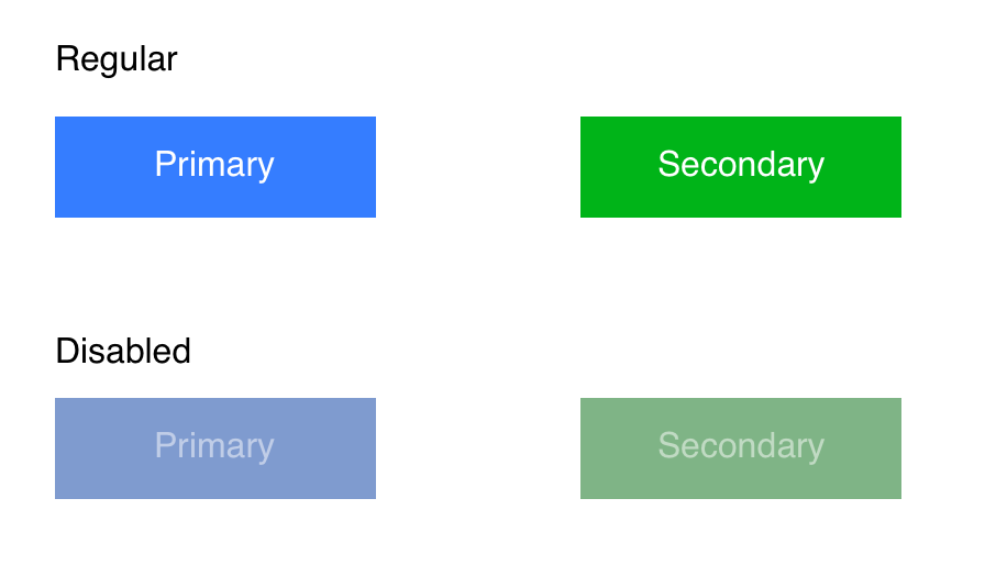
Given that our primary button is blue, and our secondary button is green, let's assume that the designer said that the background for a disabled primary button should be dark blue, and the disabled secondary button should be dark green. Not only that, but disabled buttons should be at 50% opacity.
Here's an example mockup:

Option 1: Break the specificity rule
We can still keep the same HTML:
<button class="btn btn--primary btn--disabled">
  Nope!
</button>
As for the CSS, this is where it can get complicated. It may make sense to skip strict BEM rules and do something like this:
.btn--primary.btn--disabled {
  background: darkGreen;
  color: white;
  opacity: 0.5;
}

.btn--secondary.btn--disabled {
  background: darkGreen;
  color: white;
  opacity: 0.5;
}
This technically breaks the specificity rule, which means that the disabled- and variant-related classes are combined as a single selector, making them more specific than other selectors.
Option 2: Write a joined modifier
Instead of having a single --disabled modifier, you can have one for each variant you need to override.
The HTML could look like this:
<button class="btn btn--primary--disabled">
  Nope!
</button>
And the CSS like this:
.btn--primary {
  background: green;
  color: white;
}

.btn--primary--disabled {
  background: darkGreen;
  color: white;
  opacity: 0.5;
}
Doing this won't require you to break any rules, but it may add some complexity when writing your modifiers.
When you use only one modifier class for each style, you don't need to worry about the order that you declare your classes in the HTML. Unfortunately, with this approach, you'll need to remember which order your modifiers are written in, or duplicate the order.
That means you need to remember that you put --disabled after --primary, and not vice-versa, or you'll have to duplicate the CSS with the flipped version:
.btn--primary {
  background: green;
  color: white;
}

.btn--primary--disabled,
.btn--disabled--primary {
  background: darkGreen;
  color: white;
  opacity: 0.5;
}
That's not so bad with just 2 but if we added a third, you can see how this could exponentially get out of hand. This is why I, personally, would probably break the selector rule.
Example: Coffee Menu
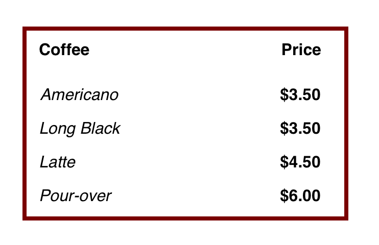
Let's assume you have a coffee menu design that the designer gave you.

Here is an example of non-BEM HTML:
<!-- bad: does not follow BEM -->
<table>
  <thead>
    <tr>
      <th>Coffee</th>
      <th>Price</th>
    </tr>
  </thead>

  <tbody>
    <tr>
      <td>Americano</td>
      <td>$3.50</td>
    </tr>
    <tr>
      <td>Long Black</td>
      <td>$3.50</td>
    </tr>
    <tr>
      <td>Latte</td>
      <td>$4.50</td>
    </tr>
    <tr>
      <td>Pour-over</td>
      <td>$6.00</td>
    </tr>
  </tbody>
</table>
With the non-BEM version, we could've styled the table like this, but it would've made assumptions about all tables. This is a common problem when using a CSS framework that provides a lot of opinionated styles for you:
/* bad */
table {
  border: 4px solid brown;
}

table th {
  font-weight: 700;
}

table td {
  padding: 8px;
  font-style: italic;
}

table td:last-child {
  font-weight: 700;
  font-style: normal; /* we need to override the default here 😞 */
}
The CSS is nice and short and this works perfectly fine if we have only one table style, but as soon as we have different table styles, things start to get crazy.
Also, it's not very legible why the styles are like that:
- why is the last child bold?
- why does the last child have their font style modified to normal, which is the default?
Here's the same example using BEM:
<!-- good -->
<table class="coffee-menu">
  <thead>
    <tr>
      <th class="coffee-menu__heading">Coffee</th>
      <th class="coffee-menu__heading">Price</th>
    </tr>
  </thead>

  <tbody>
    <tr>
      <td class="coffee-menu__cell coffee-menu__cell--item">
        Americano
      </td>
      <td class="coffee-menu__cell coffee-menu__cell--price">
        $3.50
      </td>
    </tr>
    <tr>
      <td class="coffee-menu__cell coffee-menu__cell--item">
        Long Black
      </td>
      <td class="coffee-menu__cell coffee-menu__cell--price">
        $3.50
      </td>
    </tr>
    <tr>
      <td class="coffee-menu__cell coffee-menu__cell--item">
        Latte
      </td>
      <td class="coffee-menu__cell coffee-menu__cell--price">
        $4.50
      </td>
    </tr>
    <tr>
      <td class="coffee-menu__cell coffee-menu__cell--item">
        Pour-over
      </td>
      <td class="coffee-menu__cell coffee-menu__cell--price">
        $6.00
      </td>
    </tr>
  </tbody>
</table>
You'll notice that there's a lot more HTML due to all of the CSS classes that are applied. Each td has 2 classes, one as the base class and one as the modifier.
Here's how we would write the CSS of the BEM-friendly version:
.coffee-menu {
  border: 4px solid brown;
}

.coffee-menu__heading {
  font-weight: 700;
}

.coffee-menu__cell {
  padding: 8px;
}

.coffee-menu__cell--item {
  font-style: italic;
}

.coffee-menu__cell--price {
  font-weight: 700;
}
With the BEM-friendly example, we can read the CSS and understand it better. We can see that the price is bold, and the coffee menu item is italic. We don't have to refer to the HTML to see which element is the last child of the table.
So, while the HTML and CSS are more verbose, they provide more information, ultimately making both more legible.
We write code for people, not for computers. You'll thank yourself later as your projects grow.


