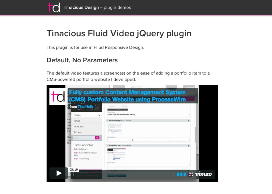
Fluid video jQuery plugin


One of the challenges in Responsive Web Design is making Vimeo and YouTube videos respond to the user’s device or screen size. I developed a fluid responsive video jQuery plugin that makes it easy for designers and developers to add fluid and responsive videos for use in their Responsive Design projects. Designers and developers simply copy the files to their server, call them in their HTML head and initialize the function on document ready passing through required parameters:
- Import jQuery
- Import the plugin files
- Create an HTML element to target for the video to append to. This can and usually should be empty.
- Initialize the script in the document ready and specify video information: video ID and type (Vimeo or YouTube).
The target element will be appended with the specified video. Files include working and minified versions of the plugin, required CSS file without any styles, a demo and instructions on implementation. Implementing the plugin is as easy as creating an empty element in your HTML, and initializing the plugin with that element:
$(document).ready(function(){
    $('.my_video').tinaciousFluidVid({
        id: 'idAbc123', // Video ID goes here
        type: 'vimeo', // `youtube` or `vimeo`
    });
});
Download the plugin from Github.