

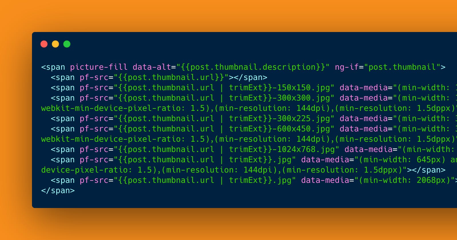


Picturefill is a great responsive images plugin. It is used for implementing responsive images, and serves up different image sizes based on screen size and pixel density. This means mobile users don’t download huge images and retina screens don’t see fuzzy, pixelated images. I wanted to have responsive images in AngularJS but Picturefill didn't work out of the box with dynaimc images because the images loaded dynamically, but only after the plugin was fired. To solve this problem, I developed an AngularJS directive to fire the Picturefill plugin at the right moment. The images are populated dynamically by Angular’s scope object and the plugin is fired after the images have loaded. It’s also important to note that data-src used to call the plugin conflicts with Angular’s ng-src so I developed a workaround: pf-src is how you declare the image source using this Angular directive. The directive can be downloaded and installed into your project using Bower and Grunt. To implement this directive with static images in your Angular project, you can do so like this:
<span picture-fill data-alt="Juicy hanger steak on a croissant.">
    <span pf-src="images/sizes/steak-croissant.png"></span>
    <span pf-src="images/sizes/steak-croissant-100.png" data-media="(min-width: 1px)"></span>
    <span pf-src="images/sizes/steak-croissant-300.png" data-media="(min-width: 400px)"></span>
    <span pf-src="images/sizes/steak-croissant-600.png" data-media="(min-width: 645px)"></span>
    <span pf-src="images/sizes/steak-croissant-1024.png" data-media="(min-width: 960px)"></span>
    <span pf-src="images/sizes/steak-croissant.png" data-media="(min-width: 1200px)"></span>
</span>
For updated usage documentation, as well as documentation for using Picturefill with dynamic data, please see the project page on Github. To see it in action, view the Responsive images in AngularJS demo.